Showing posts with label safety. Show all posts

10 Data Layers for a Predictive Wildfire Risk Map

Wildfire maps are becoming much more sophisticated.

For years, most wildfire maps focused on showing the location of an active fire, its perimeter, satellite-detected hotspots, evacuation areas, and sometimes smoke conditions. Those maps remain critical during an emergency, but a new generation of geospatial technology is attempting to answer a different question:

Where is a wildfire most likely to happen next?

Building a predictive wildfire risk map requires much more than plotting historical fires or looking at tomorrow's temperature.

Wildfire risk is created by the interaction of weather, vegetation, drought, terrain, ignition sources, infrastructure, and human activity. A useful predictive model therefore needs to combine multiple geographic datasets into a continuously updated risk surface.

Think of the system as a stack of transparent maps.

One layer shows wind.

Another shows vegetation.

Another shows drought.

Another shows power lines.

Another shows historical fires.

Individually, each layer tells only part of the story. Overlay them and a much clearer picture of wildfire risk begins to emerge.

Here are 10 of the most important data layers for building a predictive wildfire risk map.

1. Weather Data

Weather is one of the most important components of wildfire prediction because fire conditions can change dramatically within hours.

A predictive wildfire model should incorporate variables including:

  • Air temperature
  • Relative humidity
  • Wind speed
  • Wind direction
  • Precipitation
  • Atmospheric pressure
  • Recent weather trends
  • Forecast weather conditions

Wind deserves particular attention.

Strong winds can dry vegetation, increase fire intensity, carry embers ahead of a fire, and dramatically increase the speed at which flames move across a landscape.

A location experiencing 95°F temperatures and dry vegetation might already have elevated fire risk.

Add 40-mph winds and extremely low humidity, and the situation becomes significantly more dangerous.

The important distinction for predictive mapping is that weather should not simply represent current conditions.

Forecast data can be incorporated so the map attempts to show what wildfire risk could look like several hours or days into the future.

A wildfire risk map could therefore behave somewhat like a weather forecast:

Current wildfire risk

6-hour wildfire risk

24-hour wildfire risk

48-hour wildfire risk

This would allow emergency managers to see dangerous conditions developing before they arrive.

2. Vegetation and Wildfire Fuel Data

Wildfires need fuel.

In many environments that fuel consists of grasses, brush, shrubs, trees, fallen branches, dead vegetation, and accumulated organic material.

But not all vegetation burns the same way.

Grasslands can produce extremely fast-moving fires, while forests can contain enormous quantities of combustible material. Dense brush can create another type of fire behavior.

A predictive wildfire map therefore needs detailed information about the vegetation covering the landscape.

Important variables include:

  • Vegetation type
  • Vegetation density
  • Canopy coverage
  • Dead vegetation
  • Fuel loading
  • Fuel continuity
  • Vegetation height
  • Recent vegetation changes

Satellite imagery is particularly valuable for monitoring vegetation across large geographic areas.

The important question isn't simply:

Is vegetation present?

It is:

How much combustible fuel is present, what type is it, and what condition is it in?

Those factors can dramatically influence both wildfire probability and potential fire behavior.

3. Fuel Moisture

Two areas can contain almost identical vegetation but have completely different wildfire risks because of moisture.

Wet vegetation is much harder to ignite.

Extremely dry vegetation can become highly combustible.

Fuel-moisture measurements attempt to determine how much water is contained within vegetation and dead organic material.

A predictive system might monitor both live and dead fuel moisture.

This is especially important following extended periods of hot, dry weather.

Imagine a region that has gone weeks without meaningful rainfall.

Satellite observations indicate vegetation stress.

Ground stations show declining fuel moisture.

Temperatures remain above normal.

Relative humidity continues falling.

Even before a fire starts, these variables could cause the area to move from moderate to high or extreme wildfire risk.

Fuel moisture effectively helps answer one of the most important predictive questions:

If a spark occurs here today, how easily could the surrounding landscape ignite?

4. Drought Conditions

Drought creates wildfire risk over a much longer timeframe than hourly weather.

A single hot afternoon does not necessarily create extreme wildfire conditions.

Months of below-normal precipitation can.

A predictive wildfire model should therefore incorporate drought measurements alongside real-time weather information.

Important drought-related variables can include:

  • Precipitation deficits
  • Soil moisture
  • Snowpack
  • Streamflow
  • Groundwater conditions
  • Vegetation stress
  • Duration of dry conditions

This allows the system to understand the environmental conditions leading up to a particular day.

Consider two locations experiencing identical weather:

Temperature: 96°F

Humidity: 15%

Wind: 25 mph

One received significant rainfall two weeks ago.

The other has experienced severe drought for months.

Their wildfire risk may be dramatically different.

A predictive model needs that historical environmental context.

5. Topography: Elevation, Slope and Aspect

Wildfire behavior is heavily influenced by terrain.

Fire generally moves faster uphill because flames can preheat vegetation above them. Steep slopes can therefore create conditions for rapid fire spread.

Three particularly important topographic variables are:

Elevation — the height of the terrain.

Slope — how steep the terrain is.

Aspect — the direction a slope faces.

Aspect matters because sunlight exposure influences temperature and vegetation moisture.

In parts of the Northern Hemisphere, south-facing slopes often receive more direct sunlight and can become warmer and drier than nearby north-facing slopes.

Digital elevation models allow GIS systems to calculate these variables across enormous geographic areas.

Terrain information can also help estimate where a fire could move after ignition.

That means topography is useful for both ignition-risk mapping and fire-spread modeling.

6. Historical Wildfire Locations and Perimeters

One of the best ways to understand future wildfire risk is to study the past.

Historical wildfire databases can show:

  • Previous ignition locations
  • Burn perimeters
  • Fire frequency
  • Fire size
  • Fire causes
  • Seasonal patterns
  • Spread direction
  • Weather during previous fires
  • Areas repeatedly affected by wildfire

When thousands of historical incidents are placed on a map, geographic patterns can become visible.

Some corridors may repeatedly experience fires.

Certain terrain types may show higher ignition frequencies.

Other areas may experience relatively few ignitions but produce extremely large fires when they occur.

Historical fire data is especially valuable for machine-learning systems.

The model can examine conditions that existed before previous fires and search for similar patterns occurring today.

Essentially, historical wildfire maps become the training data for future wildfire prediction.

7. Lightning Strike Data

Not every wildfire is caused by humans.

Lightning is an important natural ignition source, particularly across remote areas of the western United States and Canada.

Real-time lightning detection networks can identify the location and timing of individual lightning strikes.

That creates another valuable geographic layer.

A predictive model could combine lightning observations with vegetation moisture and weather.

For example:

A lightning strike in an area that recently received heavy rain might receive relatively low concern.

A lightning strike into extremely dry vegetation during drought conditions could receive a much higher risk score.

Lightning-caused fires can also smolder before becoming obvious.

That means lightning data could be used to identify geographic locations requiring additional satellite, camera, aircraft, or ground monitoring.

Instead of searching millions of acres equally, authorities could focus attention on the locations where ignition is most plausible.

8. Power Lines and Electrical Infrastructure

Electrical infrastructure is another important potential ignition layer.

A GIS database could include the locations of:

  • Transmission lines
  • Distribution lines
  • Utility poles
  • Transformers
  • Substations
  • Electrical corridors
  • Generating facilities

Those locations could then be compared with vegetation, wind, drought, and historical fire information.

Imagine a power line crossing a heavily vegetated canyon.

The vegetation is extremely dry.

Humidity is forecast to fall below 10%.

Wind gusts could exceed 50 mph.

Even though no wildfire currently exists, the combination of those conditions could cause the corridor to receive an extreme risk classification.

Utilities could potentially use this information to prioritize inspections, vegetation management, equipment monitoring, staffing, and other wildfire-prevention measures.

This demonstrates an important concept in predictive mapping:

Risk often comes from the intersection of datasets rather than any individual dataset.

A power line by itself isn't necessarily dangerous.

Dry vegetation by itself doesn't guarantee a wildfire.

Wind doesn't automatically create a fire.

But power infrastructure + dry vegetation + extreme wind + low humidity can create a much more significant risk profile.

9. Roads, Population and Human Activity

Humans are another major component of wildfire risk.

Roads, recreation areas, campgrounds, construction zones, communities, and other areas with frequent human activity can create potential ignition opportunities.

A predictive wildfire map could therefore include geographic layers showing:

  • Roads
  • Highways
  • Trails
  • Campgrounds
  • Recreation areas
  • Construction activity
  • Railroads
  • Agricultural areas
  • Population density
  • Development patterns

Historical ignition data could then determine whether proximity to particular types of human activity correlates with wildfire occurrence.

For example, if historical fires repeatedly begin near certain transportation corridors during dry periods, those locations could receive additional weight in the predictive model.

Population information is also important for understanding consequences.

A wildfire in a remote region may threaten ecosystems and natural resources.

A similar wildfire near thousands of homes could become a major life-safety emergency.

This introduces another important mapping layer: the wildland-urban interface, where human development meets or mixes with wildfire-prone vegetation.

10. Satellite and Ground Sensor Data

The final layer brings many of the others together: real-time observations.

Satellite systems can monitor enormous geographic areas and identify changes in vegetation, land surface conditions, thermal activity, smoke, and active fires.

NASA's Fire Information for Resource Management System, or FIRMS, distributes active-fire information derived from instruments including MODIS and VIIRS. VIIRS active-fire products can provide observations at approximately 375-meter resolution, while MODIS products are approximately 1 kilometer. NASA also makes Landsat-derived active-fire products available at finer spatial resolution for supported areas and periods.

NASA FIRMS distributes these observations through downloadable GIS datasets, maps and web services, making satellite fire information particularly useful for geospatial applications.

Ground sensors provide a different advantage: extremely localized measurements.

A sensor network could monitor:

  • Temperature
  • Humidity
  • Wind
  • Soil moisture
  • Fuel moisture
  • Smoke
  • Particulate matter
  • Atmospheric conditions

Imagine thousands of sensors positioned throughout wildfire-prone areas.

Each sensor becomes another point on the map.

If several sensors suddenly report rapidly declining humidity, increasing wind and unusually dry environmental conditions, the predictive model could increase the wildfire risk score for that specific area.

Satellites provide the broad view.

Sensors provide local detail.

Together they can create a much more responsive wildfire monitoring network.

Turning 10 Data Layers Into One Wildfire Risk Score

The real power of predictive wildfire mapping comes from combining these datasets.

Suppose a geographic grid cell has the following conditions:

Temperature: Extremely high

Humidity: Extremely low

Wind: High

Vegetation: Dense

Fuel moisture: Critically low

Drought: Severe

Terrain: Steep

Historical fires: Frequent

Lightning: Recent strike nearby

Infrastructure: Power lines present

That location should probably not receive the same wildfire risk score as a nearby area with moist vegetation, flat terrain, no recent lightning and little historical fire activity.

A predictive model could assign a weight to each variable.

Conceptually, the calculation might resemble:

Wildfire Risk = Weather + Fuel + Moisture + Drought + Terrain + Ignition Probability + Historical Risk + Exposure

Machine learning could make the model significantly more sophisticated by determining which combinations of variables have historically been associated with wildfire ignition and rapid fire growth.

The final result could be converted into an easy-to-understand map.

Green — Low Risk

Yellow — Moderate Risk

Orange — High Risk

Red — Extreme Risk

Instead of displaying hundreds of complicated environmental variables, the map would convert them into actionable geographic intelligence.

Predictive Wildfire Maps Need to Be Dynamic

One of the biggest differences between traditional hazard maps and predictive wildfire maps is time.

A traditional wildfire hazard map might remain relatively unchanged for months or years.

A predictive wildfire map could change every few minutes.

At 7:00 a.m., a location could have moderate risk.

At noon, rising temperatures and declining humidity might move it to high risk.

At 3:00 p.m., unexpectedly strong winds could push it into extreme risk.

By midnight, cooler temperatures and increased humidity could reduce the threat.

This makes predictive wildfire mapping much closer to weather forecasting than conventional static mapping.

Users shouldn't just be able to ask:

Where is wildfire risk high?

They should eventually be able to ask:

Where will wildfire risk be highest tomorrow afternoon?

From Wildfire Mapping to Wildfire Intelligence

NASA FIRMS demonstrates how quickly satellite observations can already be integrated into digital mapping systems. FIRMS distributes active-fire observations from MODIS and VIIRS, with global near-real-time data generally available within hours and faster services available in the United States and Canada.

But satellite fire detection primarily tells us where a thermal anomaly or potential fire has already been observed.

The next major step is moving further back in the emergency timeline.

A predictive wildfire intelligence platform would combine satellite information with weather forecasts, vegetation, drought, terrain, historical fires, lightning, infrastructure, human activity, and sensor measurements.

Instead of simply answering:

Where is the wildfire?

The map begins answering:

Where are the conditions for the next wildfire developing?

That distinction could fundamentally change wildfire management.

Emergency managers could pre-position resources.

Utilities could increase monitoring.

Fire departments could adjust staffing.

Communities could increase preparedness.

Land managers could restrict high-risk activities.

And researchers could continuously improve prediction models as more environmental and wildfire data becomes available.

The future of wildfire mapping isn't just about creating better maps of fires.

It is about building geographic systems capable of understanding the conditions before the fire begins.

When weather, environmental sensors, satellites, infrastructure, terrain, and historical wildfire records are combined into a single geospatial platform, a wildfire map becomes something much more powerful:

an early-warning system.

Crowdsourced Mapping Projects That Inspire Change

crowdsourced maps

Across the world, citizens are taking mapping into their own hands. With smartphones, GPS, and open-source tools, people are documenting safety hazards, pollution, and social issues that once went unnoticed. This new wave of crowdsourced mapping is turning observation into action, empowering communities to solve problems faster than governments often can.

The Syndicated Maps network, founded to unify dozens of these civic data projects, now operates over 20 interactive maps covering transportation, environment, and public health. Together, these platforms show that when people map together, they can inspire real change.


The Rise of Citizen Mapping

Traditional maps are created by agencies, but crowdsourced maps are built by the people who live in the data. When someone reports a cell coverage dead zone, an unsafe intersection, or a refinery flare, that contribution becomes part of a living public record.

The best projects share four qualities that make them effective catalysts for change:

  • Purpose-driven: They focus on fixing a real-world problem, not just visualizing data.

  • Inclusive: Anyone can participate with a smartphone or computer.

  • Verifiable: Submissions are checked, moderated, and cross-referenced for accuracy.

  • Open: The data remains visible to all, driving transparency and collaboration.

This democratization of mapping has already reshaped disaster relief, transportation planning, and environmental awareness.


Global Projects That Started the Movement

Missing Maps trains volunteers to trace roads and buildings in disaster-prone regions before crises occur. The data helps aid organizations like the Red Cross reach vulnerable populations faster.

OpenStreetMap (OSM), the “Wikipedia of maps,” provides the open foundation on which thousands of apps and startups are built.

Project Sidewalk allows volunteers to tag missing ramps and broken sidewalks, giving cities valuable accessibility data.

Ushahidi, launched after Kenya’s 2008 election unrest, collects and visualizes real-time crisis reports, showing how crowdsourced information can save lives.

These pioneers paved the way for modern platforms like Syndicated Maps, which applies the same open principles to transportation safety, pollution tracking, and energy transparency across the U.S. and beyond.


How Syndicated Maps Inspires Change

The Syndicated Maps network transforms citizen input into public insight. Each map focuses on a different challenge, from dangerous intersections to abandoned oil wells, but they all share one mission—to make important data visible and actionable.

Transportation & Safety

PhotoEnforced.com crowdsources red-light and speed-camera locations, helping drivers understand where enforcement is concentrated. The site promotes accountability by distinguishing between safety-driven enforcement and revenue-driven ticketing.

BadIntersections.com turns frustration into data by allowing users to submit dangerous intersection reports. Engineers and planners can analyze patterns to redesign streets and prevent crashes.

DangerousSchools.com focuses on school-zone safety, mapping areas with poor crosswalks or high driver speeds. Parents can visualize risks and advocate for change.


Communication & Emergency Response

DeadZones.com identifies cellular dead zones and weak signal areas by carrier. In wildfire or earthquake regions, coverage gaps can delay emergency calls, making this map vital for public safety and telecom accountability.

DisasterReliefMaps.com provides a live disaster response map that crowdsources shelters, evacuation routes, and road closures during crises. Real-time updates from residents often reach neighbors faster than official alerts, while post-event archives support future preparedness planning.


Environment & Energy Transparency

DrillingMaps.com displays oil and gas wells across the U.S., combining official data with user reports of leaks and abandoned sites. Communities can see how industrial activity overlaps with homes, schools, and aquifers, creating accountability and driving cleanup efforts.

RefineryMaps.com monitors refinery flares, explosions, and odor incidents, giving the public visibility into local air-quality issues. Crowdsourced evidence helps environmental groups push for stronger regulation.

PowerPlantMaps.com maps power generation facilities, outage zones, and public feedback on noise or emissions. It highlights how energy production affects nearby communities.

SolarEnergyMaps.com tracks rooftop and community solar installations, showing where renewable energy is growing fastest. By sharing installation data and incentives, it inspires homeowners and cities to adopt solar power.


Health & Housing

HomelessMap.com helps outreach teams locate shelters, food banks, and clinics while protecting individual privacy. It turns fragmented service data into a single, searchable map for compassion and coordination.

SmellyRooms.com and SickBuildingsMap.com crowdsource mold, odor, and air-quality complaints, helping renters, hotel guests, and inspectors find problem properties and encourage remediation.


Lifestyle & Recreation

SlipMaps.com is a boat-slip and marina map that helps boaters find available docking spaces, while HockeyMap.com connects players to ice rinks worldwide. These community-driven maps show that crowdsourcing isn’t just for emergencies—it’s also about connection and shared passion.


Lessons From the Crowd

  1. Start local and scale later: Focused regional maps build engagement and trust.

  2. Make reporting simple: Mobile forms and easy photo uploads increase participation.

  3. Verify contributions: Community moderation and automated checks sustain credibility.

  4. Protect privacy: Sensitive issues like homelessness require anonymized data.

  5. Keep it open: Open APIs and data exports encourage collaboration with journalists and researchers.


Overcoming Challenges

Crowdsourced maps face natural challenges—uneven participation, data bias, and maintenance costs. The Syndicated Maps network mitigates these through cross-checking with government data, volunteer validation, and periodic audits. This hybrid model ensures quality without sacrificing community involvement.


Why Crowdsourced Mapping Matters

Every pin dropped on a Syndicated Map represents someone taking civic action. A report of a leaking oil well, a dangerous school crossing, or a blackout zone turns into evidence that can guide infrastructure investments and policy reform.

Crowdsourced mapping is not just about geography—it’s about visibility, accountability, and empowerment. The Syndicated Maps network proves that when information flows from the ground up, it sparks meaningful progress—from safer intersections and cleaner air to equitable access and environmental justice.

Crowdsourcing Data to Find the Causes of Cancer

things that cause cancer

Over the years, we’ve attended countless cancer fundraisers and charity events. Each time, we’re moved by the shared commitment to finding a cure. Yet one question always lingers: why aren’t we investing just as much time and energy into understanding what’s causing cancer in the first place?

Out of curiosity, we once searched Google for “crowdsourcing the cause for cancer.” Nothing came up. That blank search result said a lot. In a world where people crowdsource everything from road traffic conditions to consumer product reviews, it’s surprising that there’s no large-scale movement to crowdsource information about potential environmental causes of cancer.

Are We Asking the Right Questions?

Most cancer research today focuses on genetics and treatment, but what about environmental exposure? Could the underlying causes of cancer be connected to the world around us — our water, air, food, and even technology?

Stress, radiation, electromagnetic fields (EMF), pollution, industrial emissions, and diet are all possible contributors. Genetics certainly play a major role, but the growing prevalence of cancer in certain regions suggests that environmental factors may be equally important.

We need to ask whether our research agenda is balanced enough. Are we dedicating enough resources to exploring the conditions that might be triggering cancer, not just treating it once it appears?

A New Approach: Mapping What We Can’t See

This question inspired the creation of three of our mapping projects:

  • DrillingMaps.com – showing oil and gas wells across the United States, along with user-submitted reports of nearby contamination or health effects.

  • RefineryMaps.com – visualizing petroleum refineries, emissions zones, and nearby communities concerned about air and water quality.

  • PowerPlantMaps.com – tracking coal, natural gas, and nuclear facilities, alongside local reports of health and safety incidents.

We started these platforms to encourage people to share their observations. Try searching for “cancer” or “water” on any of these maps. You’ll find articles, comments, and data points from citizens who’ve noticed patterns that don’t always make headlines. For instance, multiple users have reported possible cancer clusters near oil fields and refinery zones — observations that deserve more attention from researchers.

The Hidden Cost of Industrial Growth

Industrial progress has brought prosperity and convenience, but it has also left behind invisible risks. Many industrial processes release carcinogens into the environment — chemicals that may linger for decades in soil, air, and groundwater.

Communities near refineries and power plants often experience elevated cancer rates, yet official investigations can take years and rarely produce definitive conclusions. Government agencies like the EPA and CDC are tasked with monitoring environmental health, but the pace of industrial change often outstrips their data collection.

By the time regulators identify a problem, years of exposure may already have taken a toll. This lag in data collection and response is exactly where crowdsourced mapping can make a difference.

Why Crowdsourcing Matters

Crowdsourcing empowers ordinary citizens to fill in the gaps. People who live near industrial facilities, landfills, or contaminated sites can share what they see — unusual odors, water discoloration, frequent illnesses, or local cancer diagnoses.

When these reports are plotted on a public map, patterns begin to emerge. One person’s story becomes part of a larger, collective signal. It’s not about replacing science — it’s about guiding it. Scientists can use crowdsourced information to identify hotspots worth investigating, while communities gain a sense of empowerment through participation.

Cancer Clusters and Public Awareness

“Cancer cluster” is the term used when an unusually high number of people in a specific area develop the disease. Some clusters are random, but others correlate strongly with environmental exposure. Regions like Louisiana’s “Cancer Alley,” for example, have drawn international attention due to their proximity to chemical and petroleum plants.

Similar patterns appear near industrial zones in California, Texas, and Pennsylvania. Yet official recognition is rare. Often, it’s residents themselves who first notice the trend — and that’s why open mapping platforms matter.

Crowdsourced maps like DrillingMaps.com, RefineryMaps.com, and PowerPlantMaps.com make it easy to visualize these clusters and bring public attention to areas that may be overlooked.

Public Concerns About Emerging Health Factors

In recent years, there’s been growing public interest in how new medical technologies and societal changes might relate to health outcomes, including cancer. For example, since the introduction of mRNA vaccines and other cutting-edge biotechnologies, some people have expressed curiosity about whether long-term monitoring and transparency around all new medical products are sufficient.

So far, major health organizations such as the World Health Organization (WHO) and the U.S. Centers for Disease Control and Prevention (CDC) report no evidence linking mRNA vaccines to increased cancer rates. However, these conversations highlight an important principle: public trust depends on open data, ongoing safety studies, and the ability to crowdsource and review health information in real time.

In this sense, the same tools used to map environmental exposures could also be used to track and study any potential emerging health trends — not to promote speculation, but to ensure transparency and accountability.

Government Data Isn’t Enough

Government health agencies perform crucial work, but they often struggle to respond quickly to emerging concerns. Data collection is slow, reporting systems are fragmented, and budgets are limited. Meanwhile, industries evolve rapidly, opening new wells or refineries that may not be fully monitored for years.

Public health surveillance shouldn’t have to wait for bureaucratic timelines. Real-time, crowdsourced data can complement official studies by identifying early warning signs. With enough participation, these maps could serve as an informal alert system — flagging locations where pollution, water contamination, or disease rates seem unusually high.

Building a Prevention-First Culture

The current medical system is heavily weighted toward treatment. Billions are spent each year on cancer drugs, surgeries, and late-stage interventions. Prevention, by contrast, receives a fraction of that funding. Yet identifying and mitigating environmental risks could prevent countless cases before they ever begin.

We believe a shift toward prevention will only happen if more people are involved in gathering and interpreting environmental data. Crowdsourced mapping is one way to accelerate that shift. When people can see industrial activity alongside reports of illness, the data becomes personal — it’s no longer abstract statistics, but stories tied to real neighborhoods.

What Can Be Done Next

If we can crowdsource directions, weather alerts, and even restaurant reviews, why not crowdsource data to help prevent cancer?

It starts with participation. Visit DrillingMaps.com, RefineryMaps.com, or PowerPlantMaps.com and search for “cancer,” “water,” or your own city. You might discover information that inspires deeper questions — or even drives future research.

We need more open data, more transparency, and stronger partnerships between government, scientists, and the public. Cancer may be complex, but knowledge is collective — and crowdsourcing gives us a way to connect the dots faster than ever before.

In the end, prevention begins with understanding. By empowering citizens to map what they see and experience, we can take a meaningful step toward uncovering the hidden environmental causes of cancer.

How AI Cameras & Sensors Are Transforming Safety in Daily Life

Artificial intelligence is no longer a futuristic concept—it is actively reshaping safety in our daily lives. From reducing car accidents to improving air quality and strengthening school security, AI-powered cameras and sensors are transforming how communities address risk. Unlike traditional surveillance, these systems use machine learning and advanced analytics to recognize behaviors, detect hazards, and trigger alerts in real time. Supporters argue that AI safety technologies save lives and reduce costs, while critics worry about privacy, accuracy, and over-reliance on automation. This article explores how AI cameras and sensors are being used across roads, environmental monitoring, and schools, while weighing the opportunities and challenges ahead.

AI on the Roads: Smarter Enforcement and Safer Driving 

Syndicated Maps: Revolutionizing Crowdsourced Mapping for Public Safety

In today's digital age, the power of crowd collaboration and data visualization has unlocked new possibilities for solving complex social, business, and political issues. Syndicated Maps, a mapping services development firm based in Manhattan Beach, California, is at the forefront of this revolution. With its innovative crowdsourced map databases, Syndicated Maps aims to provide a visual platform that helps users discover and tackle various problems related to public safety. In this article, we will explore the groundbreaking work of Syndicated Maps, its mission, and the diverse maps it offers to empower individuals, businesses, and governments in creating healthier and safer communities.

How Can Public Safety Be Improved: 10 Essential Strategies

Ensuring public safety is of paramount importance for any society to thrive and flourish. People need to feel secure in their communities to lead fulfilling lives and contribute to their fullest potential. However, in an ever-changing world, challenges to public safety continue to evolve, necessitating innovative and effective solutions. In this article, we will explore ten essential strategies to improve public safety, promoting a safer and more secure environment for everyone.

Why Is Public Safety Important?

public safety sign

Public safety is important for several reasons, as it plays a crucial role in maintaining the well-being, security, and quality of life within a society. Here are some key reasons why public safety is essential:

Why Don't Real Estate Brokers Disclose These 5 Safety Hazards?

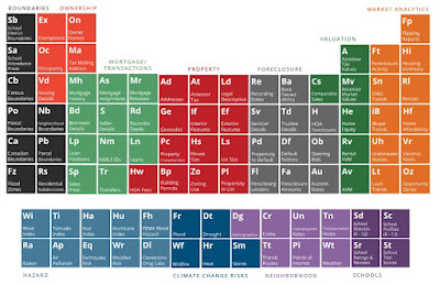
ATTOM data table of data

I asked chat GPT these questions and these were the answers it gave me below. I realize there is more detail to this response but politics and money play a huge role. Lying by omission is a huge problem in the real estate industry and the lack of disclosures is largely driven by the governing body National Association of Realtors

Biggest Failures of United States Regulatory Agencies

Regulatory agencies are not effective at their jobs, but we still need them.  How do we make regulatory agencies more transparent and hold them accountable for their actions? 

Map of Homeless Encampments & Shelters


We have been doing a lot of research for quality map data on homeless populations in certain areas and shelters.  The data we have found is very spotty and so we thought it would be appropriate to setup a map where this information could be crowdsourced.  

We started HomelessMaps.Blogspot.com as an attempt to provide better information about homeless populations and the locations of shelters in areas.  In the maps above you can dynamically search based on census data of homeless populations.  The 2nd map is a map of homeless shelters.  

If you have any information to add to this please email me at jeff@syndicatedmaps.com. 

Mapping Public Safety Helps People See What Others Can't


This video kind of explains what we do and why we do it.  However, its our belief that sharing this data with the public is more important than controlling the information and only letting a few decision makers allow who sees this information.  

Where Are The Google Public Safety "Near Me" Map Products?


Google's product team is highly focused on helping consumers find products & services "near me" based on the trend of search terms. However, when will Google Maps begin to build products based on public safety issues "near me"?

Syndicated Maps Data Marketplace

syndicated maps data marketplace
Soft Launch of New Data Marketplace

Soft launch of our new site and data marketplace we launched yesterday. We are offering a 50% discount for the anyone who purchases within the next 48 hours. Syndicatedmaps.com

Still testing the platform so we appreciate your feedback and suggestions!

Popular Articles (All Time)